What's Up?…time Robot
Website monitoring tool used by developers, sysadmins, digital agencies, and startups to monitor uptime, performance, and alerts.
Third-Party Integration
Various monitoring tools
Various notification mediums
Website uptime tracking

The Problem
Uptime Robot users face alert fatigue, lack context when diagnosing outages, and rely on multiple disconnected tools to troubleshoot and resolve incidents. These pain points create delays, reduce trust in alerts, and make ownership and accountability unclear—especially during critical incidents.
Who's Being Helped
The redesign supports developers, IT specialists, and client-facing roles who manage multiple websites or services. By streamlining alert communication and adding smarter dashboard features, it reduces manual effort and confusion, helping technical users stay focused and responsive.
The Solution
New features like role-based ownership, alert acknowledgment, incident grouping, and root cause indicators were introduced directly into existing workflows. These updates minimize alert noise, reduce tool switching, and create a more actionable and collaborative monitoring experience—all while staying within Uptime Robot’s visual and structural boundaries.
Research Goal
To uncover opportunities for improving UptimeRobot’s features based on the workflows, needs, and pain points of users with website hosting, monitoring, or development experience. Understanding how experienced users interact with UptimeRobot (and competitors) is crucial for meaningful feature updates.
Objectives
Identify current user behaviors and workflows using UptimeRobot or alternatives.
Understand key pain points and unmet needs.
Satisfaction between Uptime Robot and alternatives
Gather user opinions on potential new features
Competitive Analysis
Gaining a better frame of reference, I looked into 3 key players in the website monitoring space, additionally researching Discord's own live monitoring platform. This SWOT analysis is meant to gain insight into competitor strategies, feature sets, and user focus areas to inform future product improvements, positioning, and innovation opportunities.
Pingdom
Good: Strong brand recognition and robust uptime/performance reports.
Bad: Expensive pricing tiers limit access for smaller teams.
Opportunity: Uptime Robot can offer simpler, more affordable alternatives with similar reliability.
Threat: Enterprise users may default to Pingdom due to its reputation and broader feature set.
Discord Status-(statuspage.io)
Good: Clean, transparent public-facing status communication.
Bad: Limited use case—it’s not a full monitoring tool.
Opportunity: Uptime Robot could introduce public-facing status pages with better customization.
Threat: Statuspage.io’s adoption by major companies could raise expectations for incident communication standards.
StatusCake

Good: Competitive pricing and decent core monitoring tools.
Bad: UI is dated and can feel clunky.
Opportunity: Uptime Robot can double down on intuitive design and UX as a differentiator.
Threat: If StatusCake updates its interface, it could compete directly on simplicity and price.
Better Uptime

Good: Polished UI with integrated incident management and on-call scheduling.
Bad: Feature density can feel overwhelming to newer users.
Opportunity: Uptime Robot can position itself as the streamlined alternative with faster setup and use.
Threat: Better Uptime's growing popularity and modern features may attract Uptime Robot's core user base.
Findings
Targeting underserved segments like solo developers, agencies managing multiple clients, or SMBs running e-commerce sites could open new growth paths, especially with flexible plans and white-label tools. To stay competitive, UptimeRobot should also explore AI features like downtime prediction and smart alert suppression, helping users act faster and more confidently.
User Research
3/6 participants in person
Uptime Robot as a pre-existing website—and while targeting research participants that have experience with web hosting and monitoring tools—user research targeted their Workflow, Pain Points, and Needs.
Workflow:
Users detect issues either manually or through third-party alerts like Uptime Robot, then jump between multiple tools—logs, dashboards, and cloud consoles—to verify and triage. This fragmented, repetitive process slows response and adds friction.
Pain Points:
Common frustrations include alert fatigue, lack of context in notifications, and reliance on multiple disconnected tools. Misconfigured monitors and unclear ownership further erode trust in monitoring systems.
Needs:
Users want smarter, contextual alerts that surface relevant data instantly, simplified dashboards for non-technical stakeholders, and flexible automation—like pre-approved triage actions or service rollbacks—with minimal setup.
Research Synthesis
Common Themes Through Affinity Mapping
Affinity mapping helped surface key themes from user research, making it easier to target useful goals and features. It also revealed overlaps between competitive analysis insights and direct user feedback, reinforcing where opportunities lie.
Building Further User Empathy Through Personas
Focusing on workflows, pain points, and user needs during research made it easier to develop meaningful personas. Including each user’s tool stack helped ground their roles and added emotional context—especially when shaping Lance and Samira, who remain central to my design decisions throughout the project.


Prioritization
Aligning Project Goals Among the Business and User
A Venn diagram was used to simplify the relationship between business and user goals, highlighting areas of alignment. At the center of both lies research and synthesis: business goals were shaped by competitive analysis and background research on Uptime Robot, while user goals emerged directly from user interviews and behavioral insights.

In addition to user and business goals, it's essential to account for technical considerations, which are a critical part of this project. Given the highly technical nature of the work, there are several challenges that must be acknowledged. While some of these align with broader project goals, they deserve distinct attention as key hurdles to overcome during both the build and improvement phases.
Detailed third-part monitoring + first-party validation
Extendable webhook/event integration layer
Role-aware incident routing and communication framework
Centralized incident timeline with traceability
Structured root cause and metadata annotations
Solving Problems Through Feature Application
Taking a somewhat ambitious approach, I aimed to address three distinct problem statements through intentional feature selection and thoughtful design decisions.
Lack of context in downtime alerts causes delays in diagnosing and resolving issues.
Unclear ownership boundaries during incidents lead to confusion and slower response times.
Tool fragmentation and redundant alerts overwhelm teams with noise instead of insight.
Although the goal of this project was to design a single feature, I aimed to go above and beyond. Given Uptime Robot’s simple design system—built to support a focused, utility-driven product—I anticipated that the real challenge would lie not in recreating screens with new elements, but in addressing the deeper UX and technical complexities tied to its core purpose and offerings. In doing so, I focused on improving existing features while also introducing new ones that directly support user needs and business goals. Because of the complexity involved, I’ll dive right into the visuals to better illustrate these changes.
Initial Digital Wireframes
The first designs I’ll be displaying reflect the complexity and visual nuance of this project. To provide clearer context, I’ll walk through each improved or newly introduced feature one by one—comparing the before and after versions. These changes include enhancements to existing features through embedded micro-interactions, as well as the introduction of entirely new functionality.
Note: There are accessibility concerns with Uptime Robots UI. This mainly pertains to size and color contrast—as I make some minor adjustments— this is not the goal of the project to address the design system. My plans are to mainly to apply new features within their product in the way they should look for Uptime Robot.
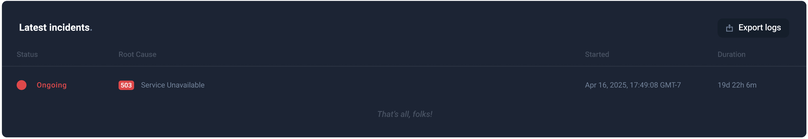
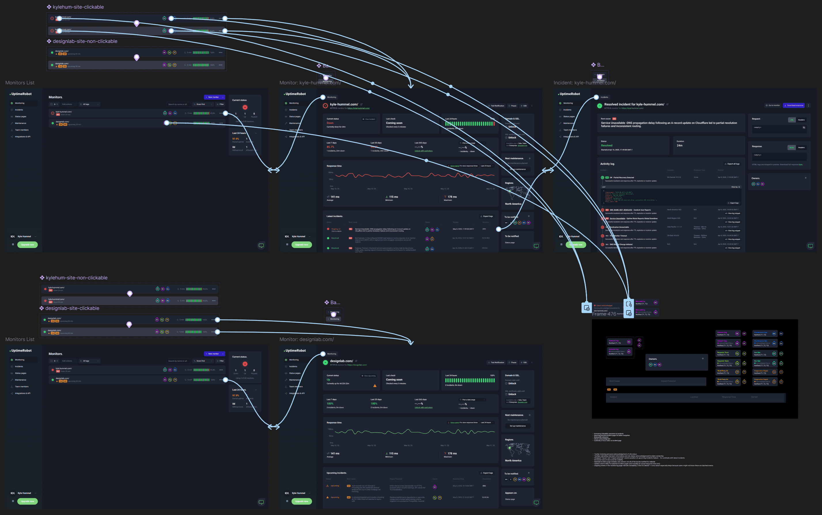
This first feature is existing on the status list page, providing the user a list of all their monitored websites. It's main purpose is display each of their monitored site's status, and whether they are up and running or not. Clicking on these will bring the user to another screen, providing information about the monitored webpage.
OLD_

NEW_


Including HTTP error code for earlier context and interpretation; this is normally listed later in the flow.
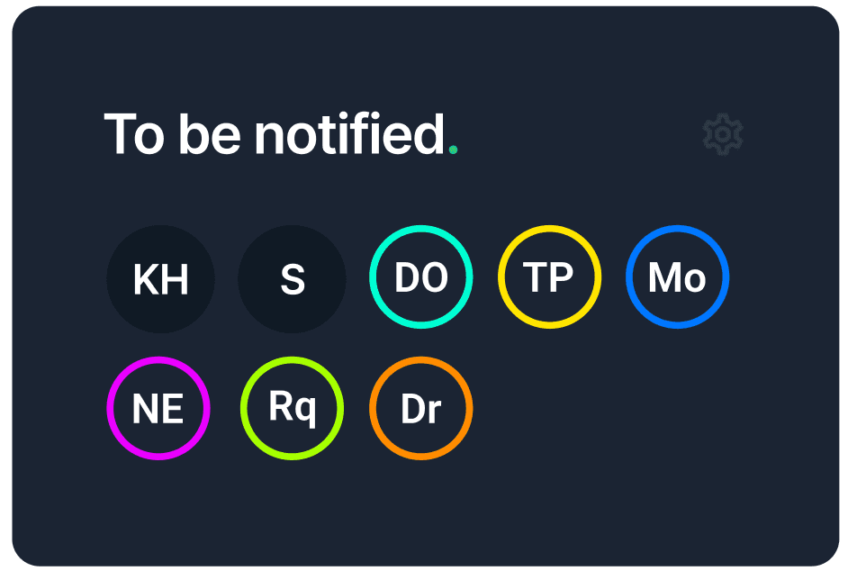
Introduction of assigned roles, a completely new addition to Uptime Robot. This allows display of ownership, as well as the supporting colored dot next to "DO" and "Mo", which provides acknowledgement of site status made by those users/roles.
Feature improvements include the relocation/sizing of the entire right side of the feature: Refresh bar, status bar, Uptime %, and Ellipses. This is for a simpler, cleaner design, without major system changes.
Not only is the site showing it's down—indicated by the downward red arrow—but the user is showing that they have acknowledged the site status (unfilled). This will go hand-in-hand with (2), as the current user could be represented by one of those roles.
Yellow triangle which seemed like a good indicator for a site that is soon to go down. This supports early detection, another user need.
This second feature is existing on the monitor details page, providing the user more information on the downed site they are looking into. Upon clicking their downed site, users will navigate to a screen listing incidents that caused the site to go down, and the time it occurred.
OLD_
NEW_
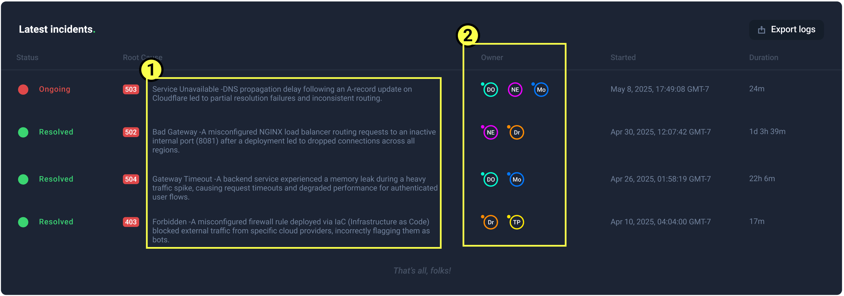
User now has a real root cause, rather than a simple HTTP code. This was one of the main pain points.
Displaying role/owner responsibility, just like the previous page.
NEW_
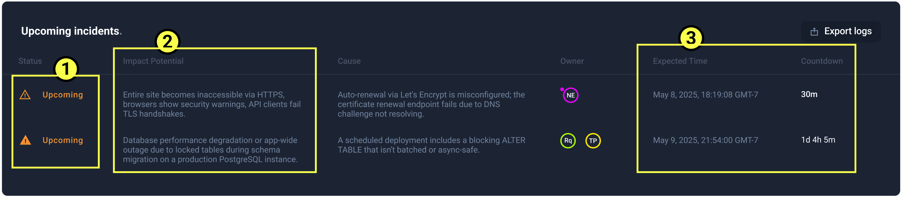
Brand new feature to support earlier indication of an outage shown by the yellow triangle from the previous screen. The user will now know when the site is going to go down before receiving client complaints!
Along with early indication—technical sources providing the root cause of the event—will allow an impact potential statement. This shows crucial information on severity.
The system will also have an expected down time, meaning that responsible roles/owners can act before this happens.
This an already existing feature that now includes the new roles. Before this was just a list of account contacts.
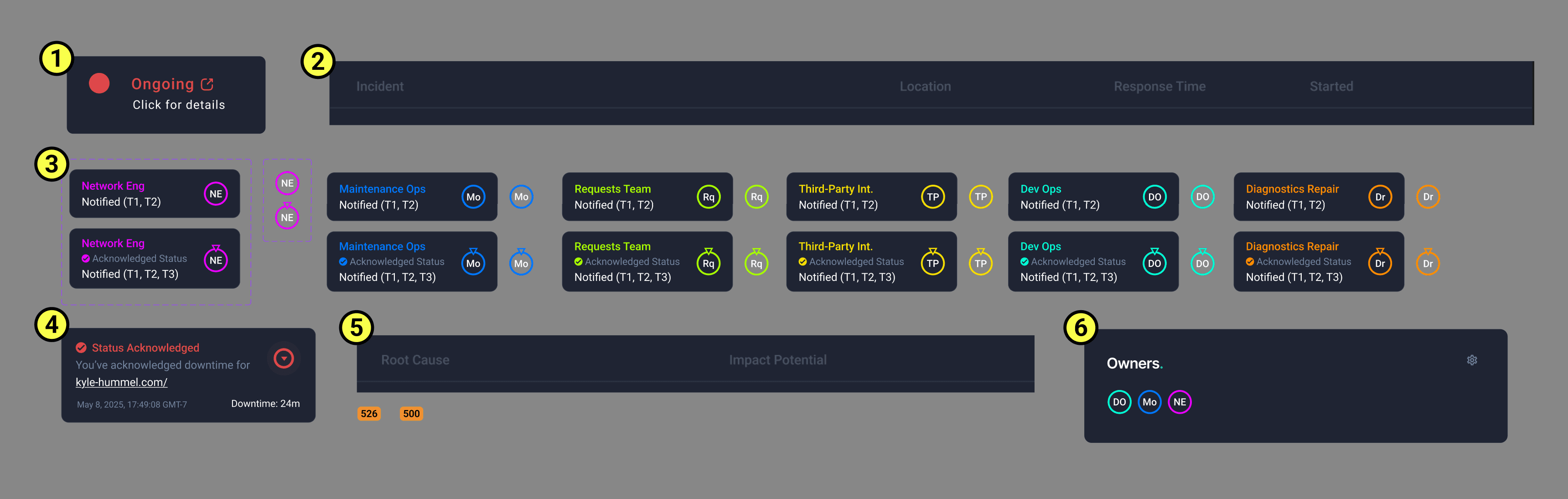
This third feature is existing on the incident details page, providing the user more information on the incident which caused an outage. This is navigated to when the user clicks on the specific event that occurred.
OLD_

NEW_

The way incidents display are now in batches. This is one of the main portions I'm referring to when calling out the minute UI differences versus major UX differences. Before, incident activity only meant servers were being pinged and responding or not. It now operates by provision of more sources or response types. Uptime Robot already has this sort of tech—but needs to apply it directly to their tools— rather than outsourcing.
Solve reason included as an example of the saved event, with all timestamps.
Because of this new approach, logs can be viewed by the user, relieving what could be tons of valuable time searching through third party apps.
Allowing different sourced pings, provides Uptime Robot with real errors as they occur. This will also provide the real initial root cause and any aftermath.
Visible ip lists for quicker digging if need be.
Expandable log snippet history saves of time by assisting reduced tool fragmentation.
User Testing to Usable Mockups
User testing lacked quality questioning to confirm proof of concept, and relation to key themes being addressed. This is something I'll improve during the usability test.
Regardless, user testing pointed out a few things which mainly had to do with the upcoming events, early detection.
BEFORE_

AFTER_

More obvious upcoming event, providing potential HTTP code reasons for the outage. This makes it larger and bolder, while also keeping with the design system.
Awkward spacing of role acknowledgment circles - now indicated with a centered triangle. This keeps from off-centering the roles from one another and also has a feeling of pointing at the role*
Adding roles and owners to upcoming events - If there's a guessed reason to the event, the system should also know who might be responsible!

Usability Testing
The usability test plan aimed to evaluate the effectiveness of new features introduced in Uptime Robot, particularly around contextual alerts, alert ownership, and incident dashboards. The goal was to validate that the updated designs improve users' ability to triage issues, assign ownership, and reduce time to resolution.
Objectives - Findings
Assess if users can successfully interpret and act on contextual alerts.
User's are able to successfully interpret and act on contextual alerts. 5/5 passed
Determine if ownership metadata helps in routing issues efficiently.
All users enjoyed the use of roles/teams and the study confirmed their effectiveness in determining ownership, and assistance in speedy triaging.
Confirm whether unified dashboards help in faster issue correlation.
Dashboard additions helped in almost immediate issue correlation, saving every user from using anywhere between 3-6 additional tools. Batched alerts also save users from noise.
Determine if the user research findings are still being addressed - Additional proof of concept.
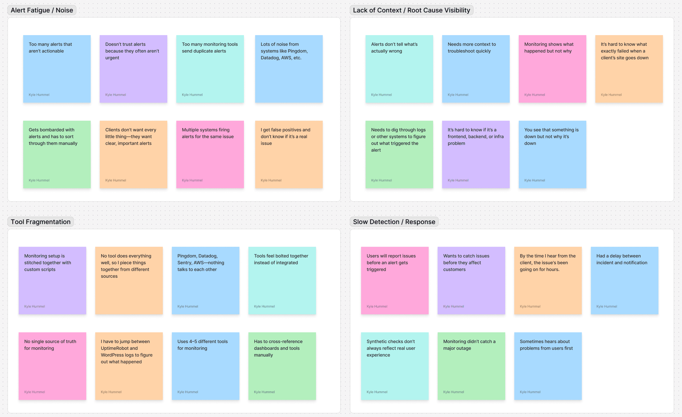
Alert Fatigue / Noise
Solved through incident batching and roles
Lack of Context / Root Cause Visibility
Solved by real root cause, and earlier introduction of root cause
Tool Fragmentation
Batching + implementation of an actual root cause rather than status code + roles with acknowledgement + inclusion of logs.
Slow Detection / Response
Integrated third party application communication with the pair inclusion of sent logs
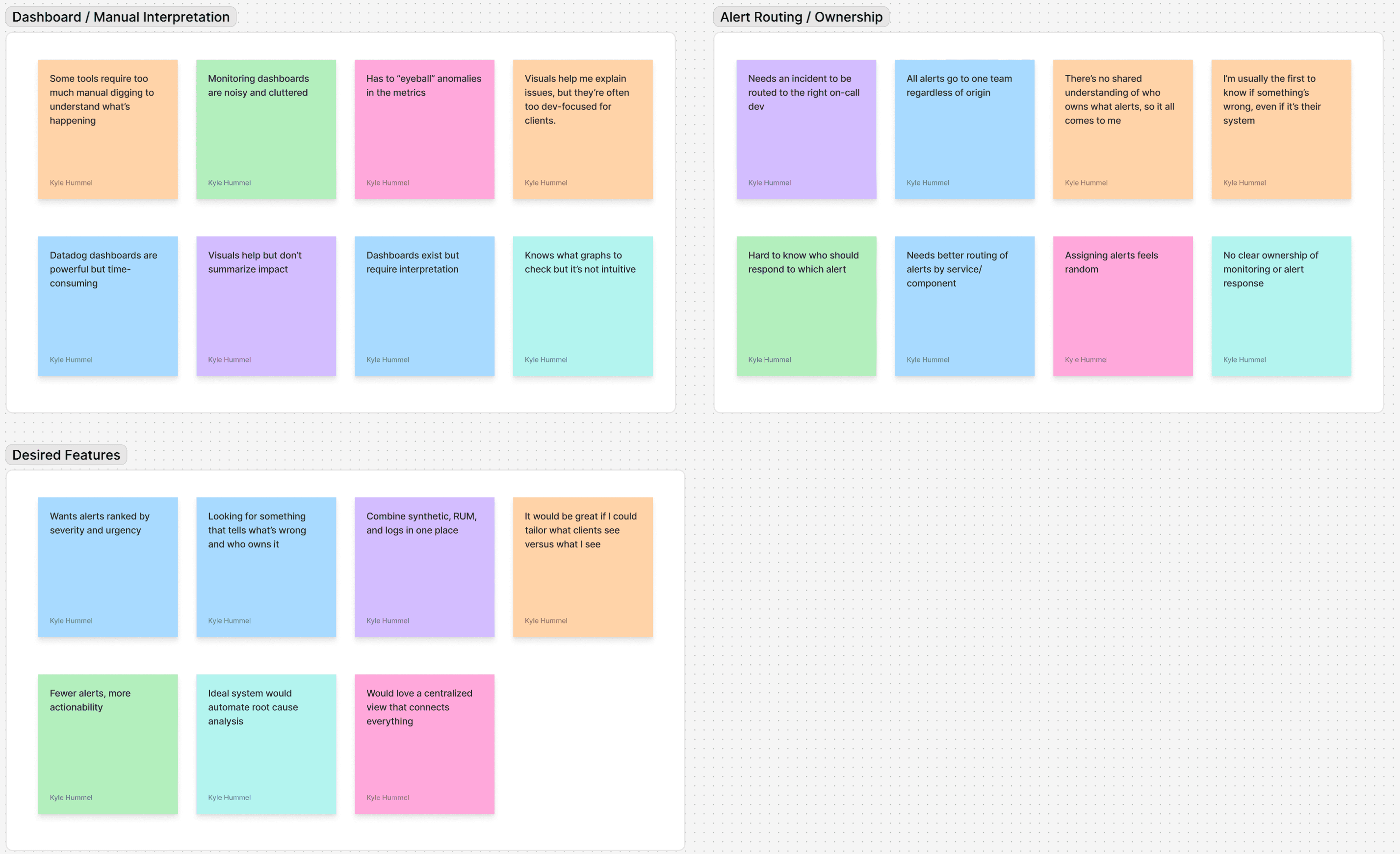
Dashboard / Manual Interpretation
Direct sources while also pairing roles/teams to specific incidents and incident batches
Alert Routing / Ownership
Specialized roles/teams with different tiers and customization
Improvements and Iterations
Although objectives and research questions were answered, usability testing pointed out the following adjustment needs.
New Page Icon with Prompt - Increasing click-ability awareness to incidents
Ongoing events in the monitoring page indicate click-ability by including a “click for details” notice + icon. This should help because users might not initially know incidents are batched.
Menu Column Labels - Improving batched incident pages for better navigation
Added column titles for batched incident page.
Added an actual response time (ms) paired with the ping location.
Hover Tooltip - Role/profile indication
New tooltip indicating role information.
Included role’s acknowledgement/incident ownership.
Slightly increased role icon size for visibility.
Role tooltips also include which tiers have been notified so far
Hover Tooltip - Clearer Personal acknowledgment
New tooltip including personal acknowledgement of site status.
Menu Column Label - Continuity of error codes on incident page
Swapped “Cause” and “Impact Potential” column position for the upcoming incidents feature - increased continuity with incidents feature layout
Added error codes to start of “Root Cause”
Contact List
Batched incident page includes only owners not all of those “To be notified.”
Final Prototype
Next Steps…
This project was a great opportunity to deepen my understanding of web monitoring. While implementing these improvements would require significant technical effort, Uptime Robot already supports third-party integrations—so I believe these enhancements are well within their capabilities.
Role/Ownership creation page - More customization and allows full understand of the feature
Mobile friendly design
Further usabiltiy testing