The goal is to create responsive designs covering desktop and mobile dimensions. I chose to target a local company which provides baseball training and coaching to a wide variety of players. I've known about Driveline since I was a kid, and have a personal interest because I enjoy sports and they provide a wide variety of offerings to choose from. This means there are plenty of UX opportunities.
Project Overview
The Problem
Many youth baseball parents, coaches, and players struggle to find training tools that are age-appropriate, clearly structured, and inclusive — leading to confusion, lack of trust, and missed developmental opportunities.
Who's Being Helped
Youth athletes (ages 8–14), their parents, inclusive community coaches, and motivated players aiming for improvement.
The Solution
Clear program details without the hassle of digging—easy-to-find info on times, age groups, skill levels, and locations. This helps parents and coaches quickly understand if a program fits their athlete’s needs without feeling overwhelmed or uncertain during the selection process.
What's going on in the space? — Let's take a look at the competition
swot analysis of Driveline among 3 competitors

Driveline Baseball
Strengths
Integrated tech + training + products; deep biomechanics R&D credibility; strong brand adoption by pros and coaches.
Weaknesses
Complex, pro-oriented UX; higher price point; limited beginner-friendly/mobile offerings.
Growth Opportunities
Package simplified, mobile-first programs that guide youth players, parents, and coaches through a clearer “start here” path.


Tread Athletics
Strengths
Highly personalized remote coaching; strong content engine (YouTube/social); lean, scalable online model.
Weaknesses
No proprietary hardware or software; pitcher-only focus limits market; quality control risk as coaching staff scales.
Growth Opportunities
Broaden into hitting/position-player tracks and bundle third-party tech into a branded training app.

Cressey Sports Performance
Strengths
Elite S&C reputation with MLB athletes; holistic rehab/pre-hab expertise; loyal long-term clientele.
Weaknesses
Minimal digital or remote footprint; tech adoption lags peers; revenue tied to brick-and-mortar capacity.
Growth Opportunities
Launch hybrid or fully online strength programs with integrated data tracking to reach traveling and youth athletes.
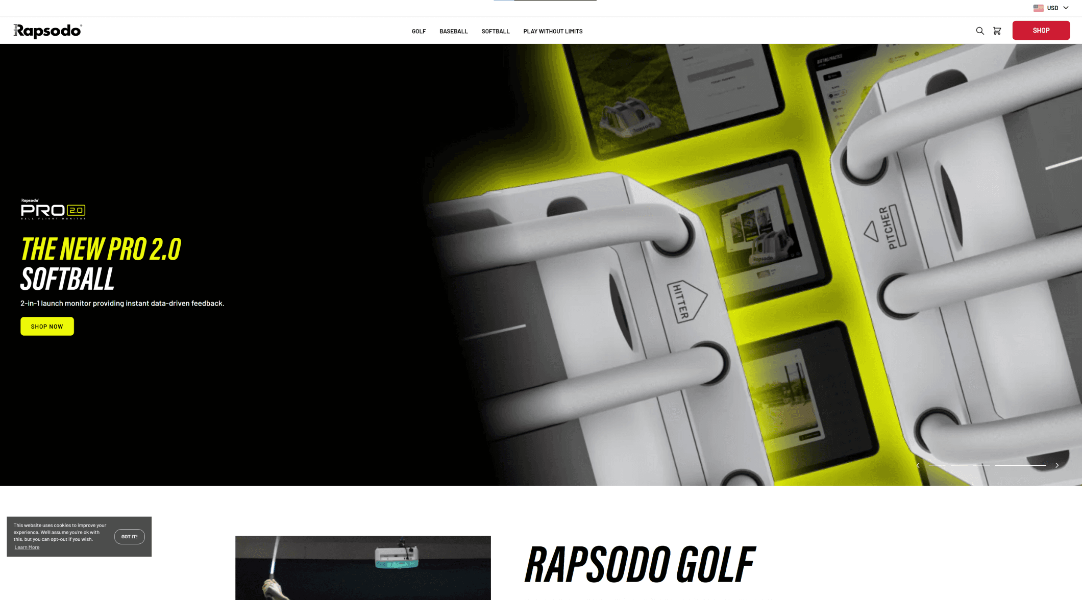

Rapsodo
Strengths
Market-leading ball-tracking accuracy; strong institutional partnerships; robust analytics dashboard integration.
Weaknesses
Hardware-only revenue model; limited direct-to-athlete content; constant R&D costs to stay ahead.
Growth Opportunities
Create affordable, app-based feedback tools and coaching bundles to capture the growing consumer and youth segment.
TL;DR
Driveline Baseball stands out for its advanced, tech-driven training system that blends coaching, proprietary hardware, and data analytics. While this gives it an edge, it can also feel overwhelming to newer or younger users. To grow, Driveline should simplify its digital experience and expand accessible tools without losing its elite edge.
Although I can't effect their offerings, I can design flows to assist here…
User Interviews
Interviews focused on youth athletes, their parents, and coaches. After learning more about Driveline and their competitors, it seemed there was an opportunity to support this demographic. My research aimed to understand how players, parents, and coaches perceive and engage with baseball training, sports technology, and Driveline's offerings.
The goal:
Identify opportunities to improve usability, accessibility, and value communication across their digital training ecosystem.
Research Question Findings
What do you look for in a baseball training tool or program?
Clear, age-appropriate drills with structure and simple guidance. Bonus if it’s fun, affordable, and easy to follow at home.
How do you evaluate if something is worth the money or time?
Word of mouth and visible results matter most. If pricing or what’s included isn’t clear, people move on.What gaps do you notice in available options today?
Most programs overlook younger kids, beginners, and parents. There’s also little tailored content for girls or casual players.What builds or breaks your trust in a program?
Trust builds through relatable success stories and transparency. Vague descriptions and jargon-heavy pages break it fast.How do you (as a coach or parent) support players outside of practice?
Most use YouTube, peer tips, or basic gear at home. They want guided, low-pressure ways to help kids improve.
Interview Synthesis by Affinity Map Groupings
Reviewing all the responses from interview participants can be daunting. To help read between the lines, I typed standout user quotes, or took anecdotal sticky notes within FigJam. Organizing these sticky notes started to gather through like-topics listed below. I'll need to fulfill as many of these topics as I can through my designs.
Discovery & Awareness
Trust & Credibility
Development & Philosophy
Injury Concerns & Safety
Fun & Engagement
Local vs Remote

Personas
Those who I'm applying affinity map findings for! When thinking about who I'm designing for, I want to consider their Goals, Frustrations, and Needs. Having a better understanding of where users are coming from, it's helpful to think about their knowledge of industry training and tools. An awareness bar will remind me that certain users won't know what to look for.
The Focused Prospect

Riley (17)
High school pitcher
Tools / Industry Awareness
“I just want clear paths… like here’s what got me from 80mph to 90mph. Not a bunch of drills with no order.”
Goals
Increase pitching velocity & get recruited
Follow a clear development path with measurable progress
Frustrations
“Some courses feel scammy.”
“I just want clear paths... not random drills.”
Needs
Roadmap-style training with progress stories
Transparency on gear and results
Feedback from experts to avoid wasting time
Riley is a highly motivated high school athlete trying to improve specific metrics to get recruited. He trains independently, tracks his own data, and actively experiments with tools.
The Inclusive Coach
Isabella (24)
High school coach & former D1 athlete
Tools / Industry Awareness
“There’s so much potential in these tools… but they need to remember who’s being left out.”
Goals
Empowering the youth females
Provide developmentally appropriate, inclusive tools
Frustrations
“No images or testimonials of girls using the product.”
“Not everyone can commit to full-time remote programs.”
Needs
Customizable plans based on age, gender, and skill level
Better representation in product marketing
Flexible, mobile-friendly resources with feedback access
Isabella is a former D1 athlete who has first hand experience feeling there is a need for more accessibility. She coaches high school softball and baseball, understanding the lack of visibility her girls feel.
The Developmental Dad

Debrick (34)
Youth baseball coach and parent
Tools / Industry Awareness
“The programs that work are the ones that make it feel like a game, not a grind.”
Goals
Make baseball fun and engaging for young players
Support his son’s learning with clear, age-appropriate tools
Frustrations
“Most programs don’t match where my kid is at.”
“Kids get bored fast if it's too rigid.”
Needs
Simple, gamified instruction
Safe mechanics with visible progress
Products built for early-stage players, not just elite ones
Debrick is a supportive dad who coaches his son’s Little League teams. He’s not always sure what to train certain ages or skill levels, and knows there’s more than just improvement on the field.
Project Goals: When planning for design, I wrote down business goals offered by competitive analysis and users goals based on personas.

Forming problem statements to the provided goals made things clearer to see which could be addressed in unison. I formed 3 problem statements but one pertains to a majority of the goals, meaning it has the highest chance to satisfy the most people.
Problem Statement:
Parents of youth baseball players lack clear, trustworthy, and beginner-appropriate guidance when evaluating training tools and development plans, which undermines Driveline’s ability to convert and retain this critical customer segment.
How might we make it easier for parents to understand and trust Driveline’s training options for younger athletes?
How might we guide parents toward the right plan based on their child’s age, skill level, and goals?
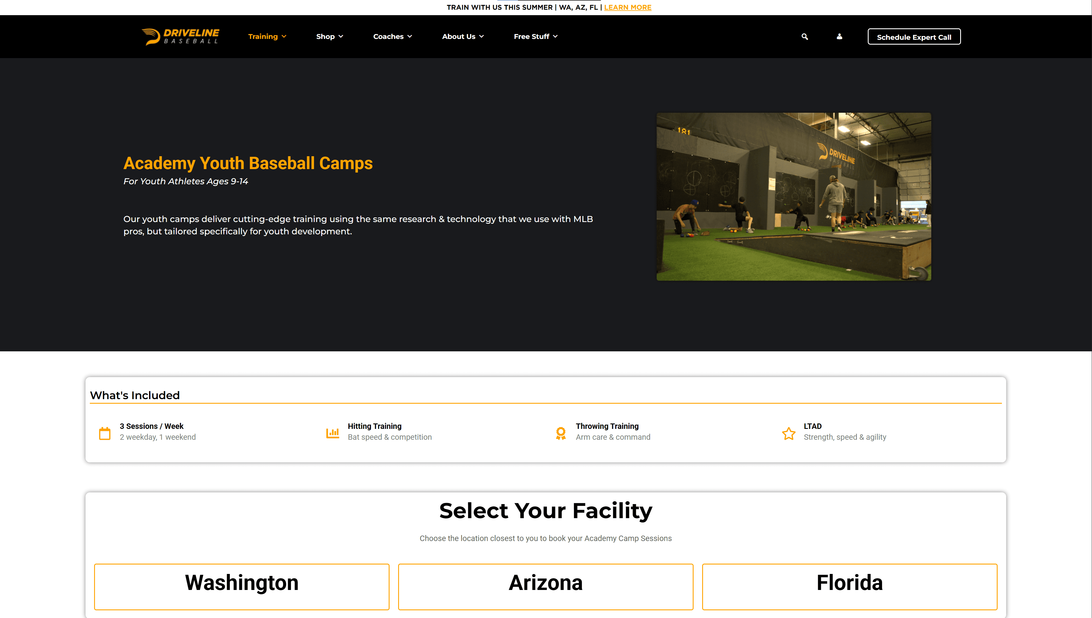
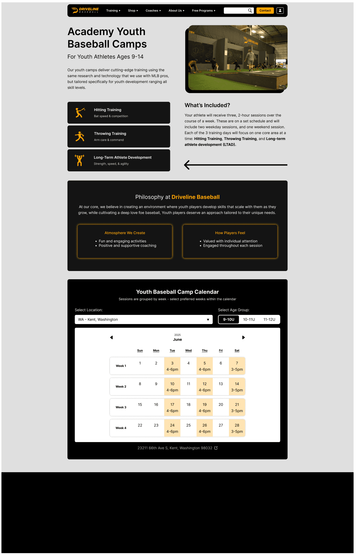
Driveline's - Youth Baseball Camp
Driveline offers a wide range of services and products, and while there’s clear user demand for more honest, accessible information, it's important not to disrupt existing SEO strategies or keyword targeting. For example, adding direct homepage links to specific offerings—like the youth camp program—may not align with Driveline’s current homepage strategy or broader business priorities. Future iterations could explore how to elevate offerings like the youth camp in a way that supports both user needs and business alignment.
That said, Driveline’s pre-existing youth baseball camp presents a strong opportunity to target this project’s goals and address the problem statement. It directly supports a current Driveline offering while also helping drive targeted traffic to a valuable service that’s already in place.

Click to enlarge an image
Design Phase
Driveline’s website is currently designed with a desktop-first approach, which informed my decision to adopt a graceful degradation strategy. Given the site’s structure and content density, it made sense to hold off until high-fidelity desktop designs before adapting them for mobile.
Improved Task Flow: Signing up for a youth baseball camp

This eliminates two screen from the original site. Users will now select the date/age within the "Camp Information" screen.
While evaluating the existing Youth Camp page—in light of the problem statement and related “How Might We” questions—one issue stood out immediately: the page lacks sufficient information to help users make an informed decision. It doesn’t clearly communicate whether the program is a good fit, especially for parents new to Driveline or youth baseball training. As a result, trust and clarity are compromised early in the experience.
To address this, I made several structural improvements—most notably, adding a calendar preview so users can see available sessions (by time, date, and location) before entering the sign-up flow. This solves two key problems: it gives users better control over their decision-making, and it introduces a clear way to exit or return—something the original flow lacks unless the browser's back button is used.
Currently, some of the most important decision-making details are hidden behind the very button that launches a no-return sign-up process. Users are expected to commit without context, leading to potential frustration or premature exits. Surfacing this information earlier ensures that users aren’t asked to decide before they’re ready—and helps prevent unnecessary drop-off.


Building out the expanded megamenu, without changing keyword ranking in SEO.
This is a mandatory feature for reaching the youth camp program without disrupting unknown business strategies.

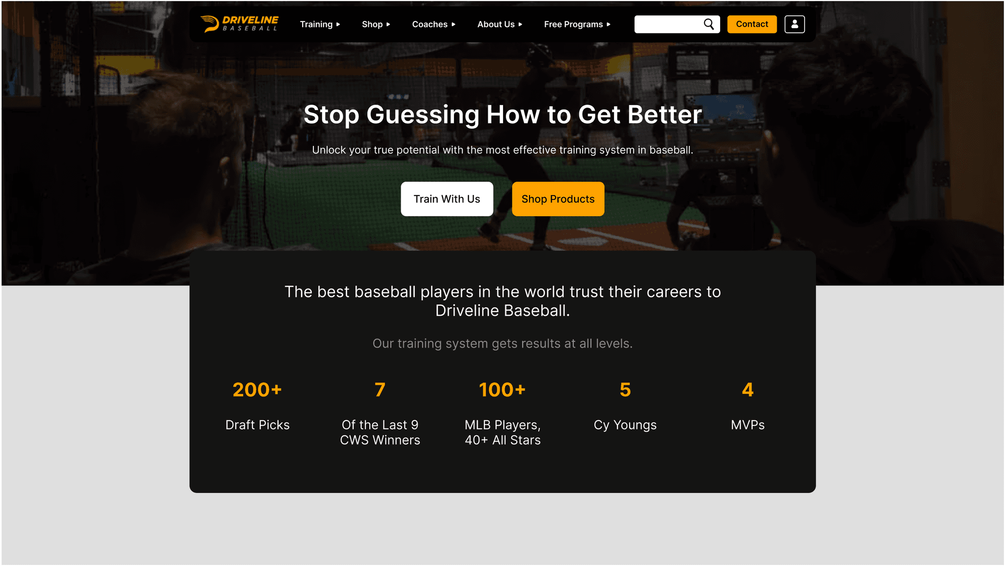
Recreation of the home page for a flow starting point.
Enabling a complete user flow starting from the homepage creates a more realistic entry point—even without a prominent call-to-action. This approach maintains alignment with Driveline’s existing SEO strategy and business goals, while offering a more accurate reflection of how users would naturally navigate the site.

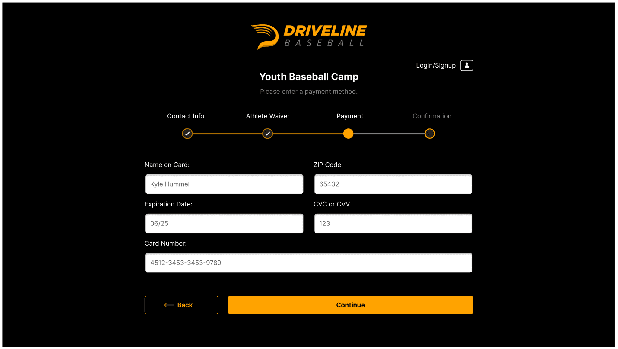
Supporting checkout flow for the Youth Camp.
User Testing to High Fidelity Mockups
By observing overall UX decisions—particularly around the usefulness of the Youth Camp page, the new calendar feature, and the improved information architecture—quick user testing of the mid-fidelity wireframes confirmed that the core concepts were functioning as intended. However, some refinements were still needed to improve user understanding and better convey the design intent.


Now that hi-fidelity desktop mockups are up and running, mobile designs follow!

Beyond general visual enhancements like improved color, typography, and iconography, specific adjustments based on user testing include:
Usable navbar with dropdown - Complete prototype of the navigation menu bar for mockup usability testing.
Enabling a complete user flow starting from the homepage creates a more realistic entry point—even without a prominent call-to-action.
Form filler text - Indicating use and expected value strings to support faster comprehension.
Entry box height - Readability and use. Text boxes were shrunk to better match font and screen space.
Button Resizing and Relocation - The profile sign-in has been relocated to the top-right corner to create a more seamless and familiar experience within the task flow. Additionally, the back button was moved next to the continue button to clearly signal that users have the option to go back at any point in the process.
Increased line spacing - Readability
Calendar Information- More information is now frontloaded to help users understand what’s available from the start. Dropdowns and toggles give users greater control, allowing them to explore options directly from the main page. This makes it easier to determine if the youth camp is the right fit in terms of timing, location, age group, and skill level.
Checkout Progress - Current progress bar during checkout changed to not feel so much like page navigation buttons.
After making improvements, mockups are now ready to be tested for their usability.
Usability Test
(Remote - Semi-moderated - Qualitative and Quantitative Data - 5 Participants)
Objectives:
Ease of Navigation - Can users find the youth camp registration section from the homepage or program landing page?
Comprehension - Do users clearly understand what the camp includes, who it’s for, and what to expect?
Decision Support - Does the flow provide enough information to help parents feel confident in signing up?
Form Usability - Is the checkout form easy to complete and free of friction?
Device Responsiveness - Does the experience function well and remain clear across screen sizes?
Being done well:
Calendar feature is appreciated
Mobile layout is stacked well
Age based training is well received
Many enjoyed seeing training philosophy
Needs Improvement - Categorical themes for improvement focused on decision support and comprehension. Explicit improvement opportunities include:
Up front pricing
Clear camp breakdown
Coach bios
Call-to-action button
Skill level tags and other personalization
Secure payment indication
High-Fidelity Iterations
With the given timeline for project completion, iterations focused on the most pertinent and time-efficient adjustments.

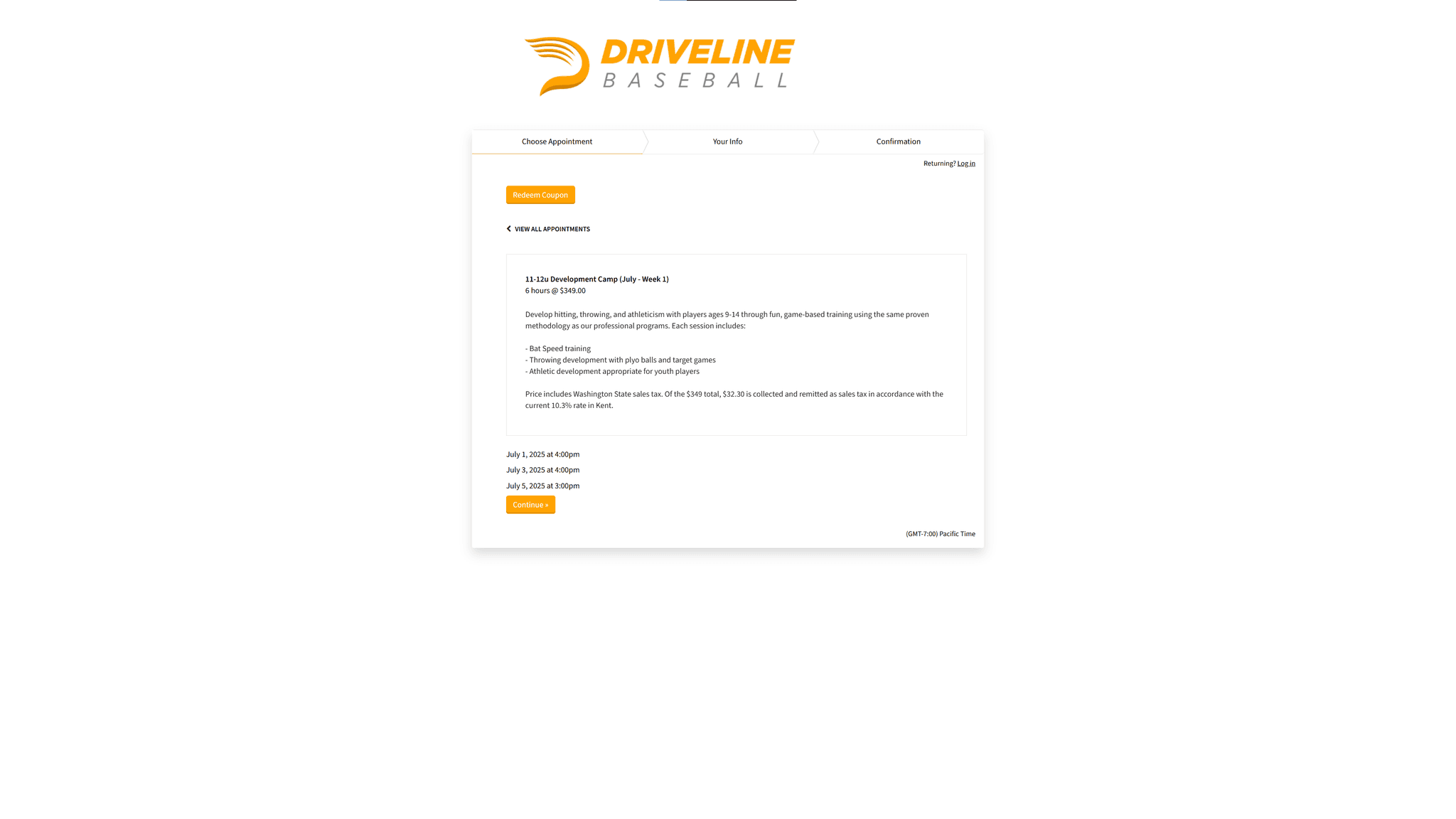
Confusion around pricing is assisted by adding total running cost as users select program week x count. This also provides the important program information to confirm what they clicked on is correct. In the example, the user has selected "x1 Kent - June 2025 Week 1 - Youth 9-10U", confirming their selected count of trainings ordered, location, date, and age group.
Skill level was another user concern, solved by the addition of another slider, such like Age Group selection. I did this so users still view and determine options early in the flow. Wanting to see age is important, but the addition of skill level gives the user another layer of customization and confidence with their selection.
Reduced calendar to just list relevant camp days for it's respective week. Each camp is 3 days out of a week, and generally the same days of the week, so there's no need for a full calendar. This also allowed more screen space to add another visible month.
Checkmarks are included by each week number to improve calendar use comprehension. This is paired right next to the week number to indicate a user chooses their preferred grouping of days (eg Week 1, week 2, Week 3, Week 4)
Font More valuable information like the calendar day is larger and bolder than something less important like day of the week, which is also repetitive anyway. Selected weeks
Color improvements: Selected weeks having a stronger color scheme to stand out from non-selected weeks. Non-selected weeks also have a more grouped look based on color proximity. There aren't anymore white gaps indicating non-camp days, which was furthering confusion.
Better prompting and the use of a disabled button also add to user cues for increased intuitiveness.
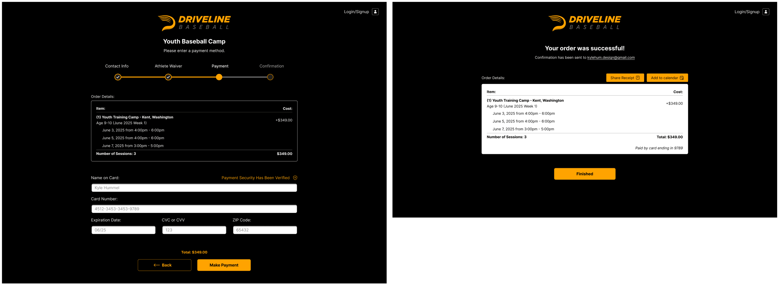
Full pricing and itemization now included and consistent
Receipt sharing and calendar sharing buttons included
Centered back and continue buttons for a better and more consistent look
Login/Signup is top right so that it stands out but also doesn't get in the way
Secure payment verification appears next to user card entry for ease of mind

Here's a look at the mobile adaptation with the same improvements.

It seemed to skip my mind having a fully built mobile navigation, this is now part of the mobile flow!
Final Prototype

Next Steps
Looking ahead, a more engaging and user-friendly way to surface Driveline’s offerings could involve a homepage toggle—similar to the existing state sign-up feature—that reveals all programs or purchase options in one centralized, scannable view. This approach improves discoverability while staying aligned with business goals.
Next steps include several usability enhancements based on testing feedback, such as:
Adding a, "Sign Up Below" jump to near the top of the Youth Camp page. Providing useful information so that the user may make decisions is good, but I don't want to allow drop-off from people who get bored or don't scroll to the calendar.
Introducing a more guided user path without disrupting existing SEO or keyword strategies on the homepage.
Adding an optional packing list and a step-by-step guide to help parents explore program details more thoroughly.
Including coach bios within program offerings to build trust, showcase expertise, and personalize the experience for parents and athletes.