Case Study
e
Overview
UX Research & Design
Kyle Hummel
Duration
6 Weeks
Tools
Figma, Figjam, Illustrator, Photoshop, Chat GPT
Able is a responsive, mobile-first website which aims to improve people's health.
The daily, weekly, and monthly expectations to improve one's health is overwhelming and hard to keep track of. Appointments, prescriptions, exercise, and nutrition are at a constant lag for most individuals.
The goal is to find a way in which website features can support people in their goals to take care of their health.
Research
User Interviews - empathize with the users
Goal (where we need to go)
Understand a person's perception of "improving one's health", things that get in the way of this, and what ways we can help to motivate them and/or diminish obstacles they face.
Research Objectives (how we will get there)
Understand what individuals believe improves their health
Understand long/short-term goals and the obstacles people face
Explore what each healthy goal entails with regards to setting and pursuing
Learn how to influence user routine and response
Methodologies (how we will learn this)
Competitive research to see what similar companies have to offer
In-person interviews to better gauge responses and obtain more information from relative in-field users (healthcare, fitness, etc.)
Surveys with various response types (e.g. open-ended, multiple choice, closed questions, rating scale)
Findings
User research responses told us there are four categories of health.
Exercise
Nutrition
Hydration
Sleep
Affinity Mapping - pull understanding from user research
However nice it is to gain insights through literal responses, there's more to unpack! To fully grasp insights made through user research, I implemented a wonderful tool called affinity mapping. This involved gathering statements or noticeable occurrences, then grouping into like-categories.
Synthesization brought about four major topics that people deemed important: Accountability, Motivation, and Personalization.

What does this mean in terms of the project goal?
————————————————————————————————————————
Able's Challenge
Motivation, Accountability, and Personalization
Research revealed that while most people recognize what contributes to good health, the barriers are:
Staying motivated consistently
Holding themselves accountable
Adapting plans to fit unpredictable schedules and personal needs
————————————————————————————————————————
Personas - translating empathization
Target users are late 20s to 50s, often strapped for time, and need accountability to make the most of their available time. Creating this persona helped determine what is needed and how to validate direction.

Understanding what a typical user might want and need helps us translate research findings into ideas.
Ideation to Prioritization
HMW Questions - established solutions, for who, for what reason
How might we improve motivation for individuals struggling with consistency so that they can maintain their health habits despite burnout and setbacks?
Encouragement Cohorts
How might we create effective social accountability for people who rely on external reinforcement so that they can build sustainable health habits long-term?
GPS Planner w/ Calendar
These very specific "How might we" questions assist with potential solutions for problems that directly affect users. We now have an overarching idea of what sort of implementations should be made when thinking about User Goals. These help us apply and validate features not only for users, but also businesses.
User & Business Goals
Partnership monetization
Improve brand authority
Modular architecture
User adoption
Long-term habit formation
Cross-platform availability
Machine learning personalization
Data-driven insights
Track progress without punishments
Simplify health planning
Stay consistent without feeling overwhelmed
Flexibility in scheduling
Feeling support and encouraged
Integrate with existing tools
Receive personal suggestions
Gather meaningful user data
Ensure scalability
Business Goals
User Goals
Tech Consideration
Encourage premium features
User retention
Community engagement
Offline option
Language options
Dark/light mode
Colorblind mode
Gamification elements
Trust and security
Voice-assistance
Smart reminders
What does this mean in terms of the project goal?
————————————————————————————————————————
Able's Solution
A Flexible Health Companion
Create a health-focused platform designed to meet users where they are — busy, overwhelmed, and seeking support.
Through smart tracking, encouragement cohorts, and personalized reminders, Able can help users build sustainable health habits, even within limited time.
————————————————————————————————————————
Features - deciding which features are a must
Now that we have a diagram of project goals, let's explore potential features in which we can achieve the most important ones. There are many ways in which people come up with features or determined their potential, but the MoSCoW method seemed to be the most effective in this scenario.
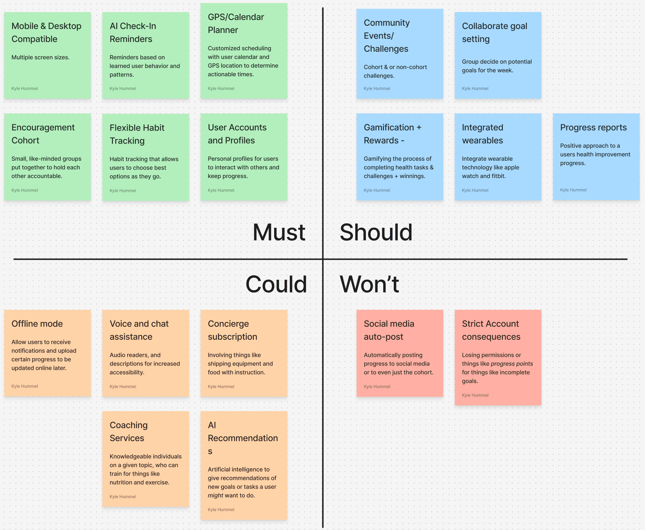
Feature Prioritization
After consolidating user needs and business objectives, I narrowed features to these must-haves:
Encouragement Cohorts: Small groups offering mutual support
Smart Reminders: Timely nudges based on personal goals and schedules
Flexible Habit Tracking: Customizable habit builders adaptable to any lifestyle
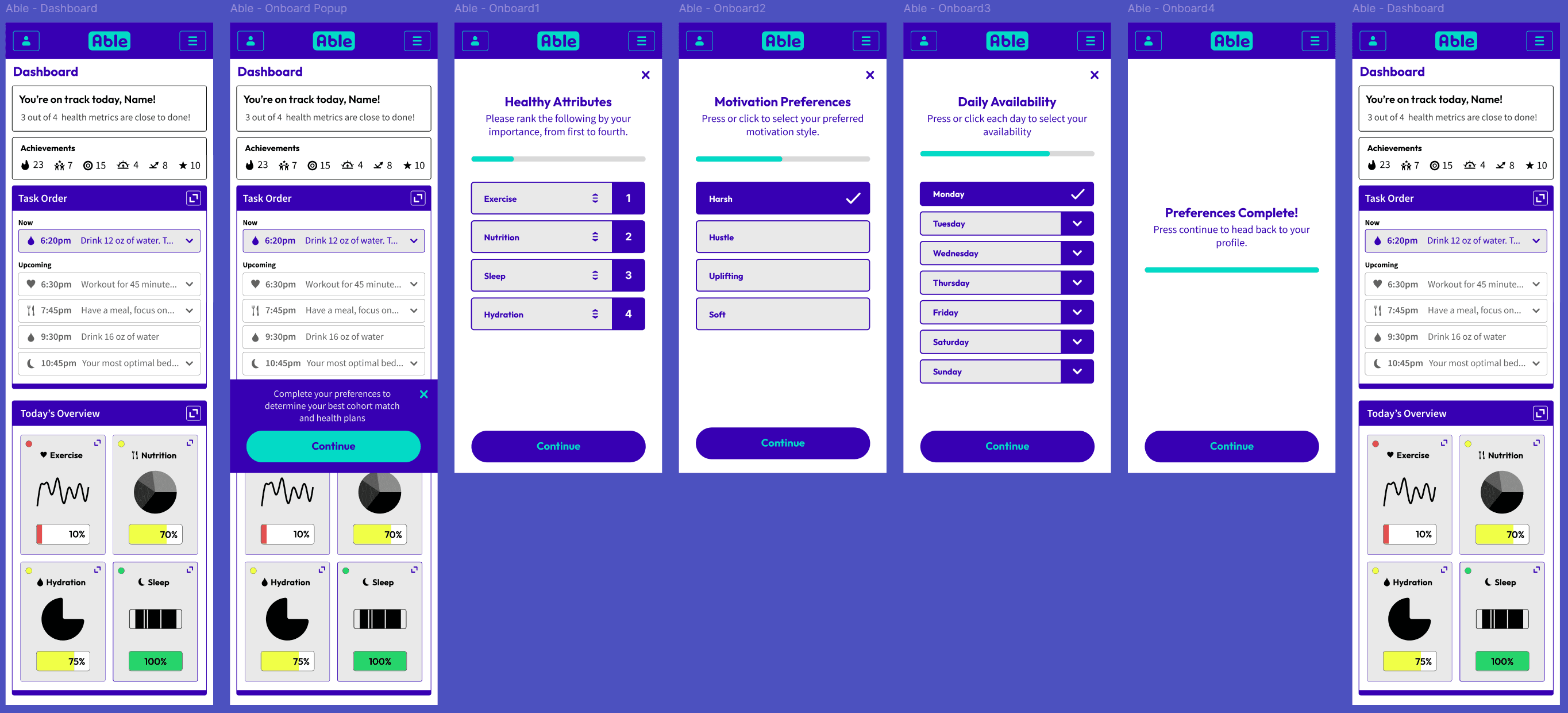
User Flows - visualize the use of these features in a journey
User Flows & Task Flows
I mapped user journeys for:
Onboarding Wizard: Personalize user profiles and goals
Cohort Selection Flow: Match users with encouragement groups
Login/Sign-Up: Smooth, barrier-free entry points

Design
Before low-fidelity wireframes, it's important to point out initial inspiration. After looking into apps/websites like Headspace and Duolingo, I decided to aim for:
Rounded elements
Vibrant colors
Engaging, playful visuals to encourage continued use
Keeping that in mind, let's move on to the iterations!
Low-Fidelity Wireframes - Sketching out initial design iterations
These wireframes emphasize
Profile-forward design: Personal health goals visible upfront
Guided flows: Step-by-step interactions to prevent overwhelm
Stat cards: Quick, digestible health tracking summaries
Rounded visuals: Approachable, non-intimidating feel
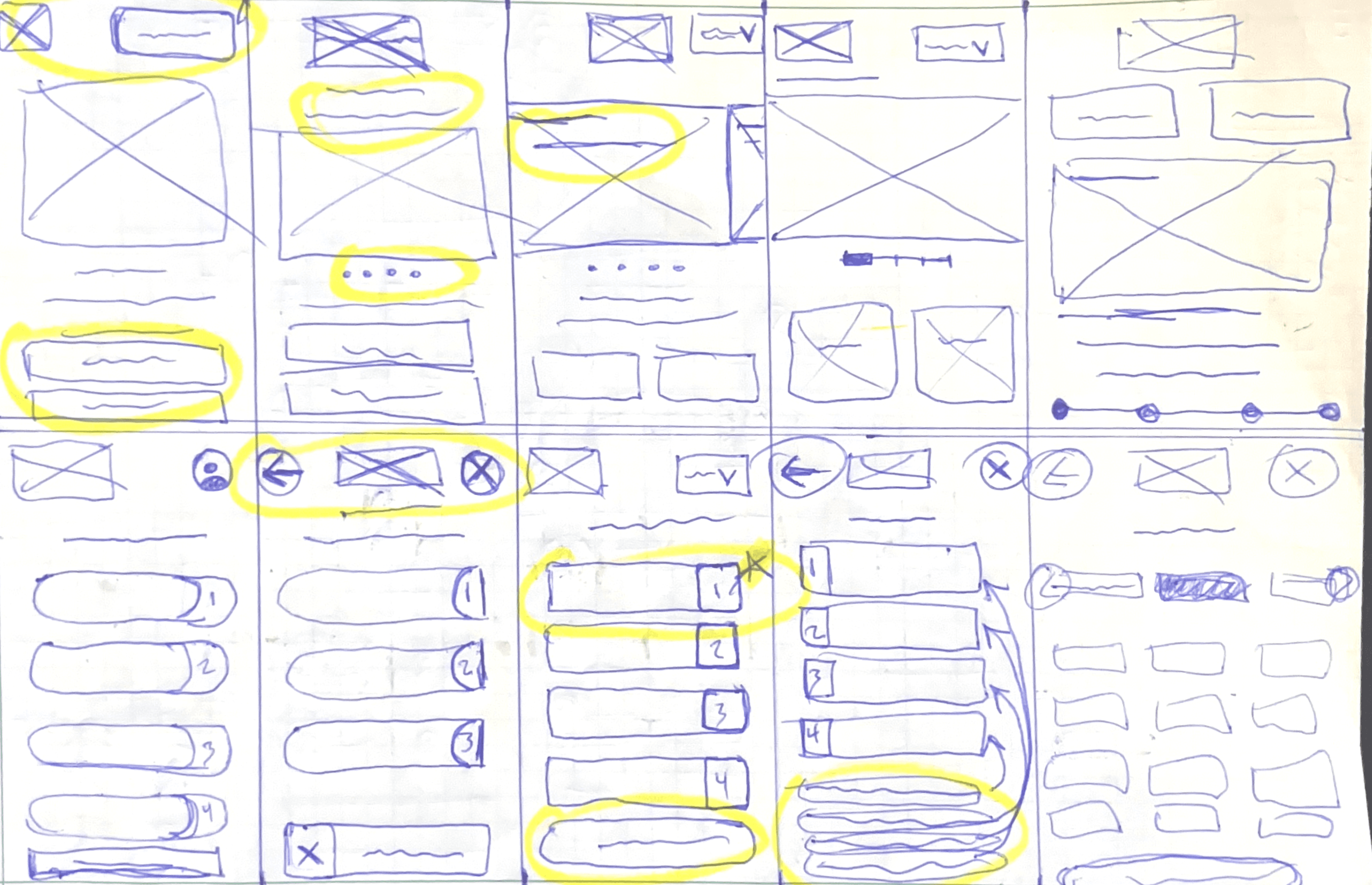

These sketches helped save a lot of time when it comes to digital iterations, but we need to see how they look after digital renditions
Mid-Fidelity Wireframes - Expanding on design iterations
Throughout the design process, I iterated to refine:
Focus on personalization without overcomplication
Emphasis on positive reinforcement (celebrations for streaks, etc.)
Cohort matching process made intuitive and non-intrusive
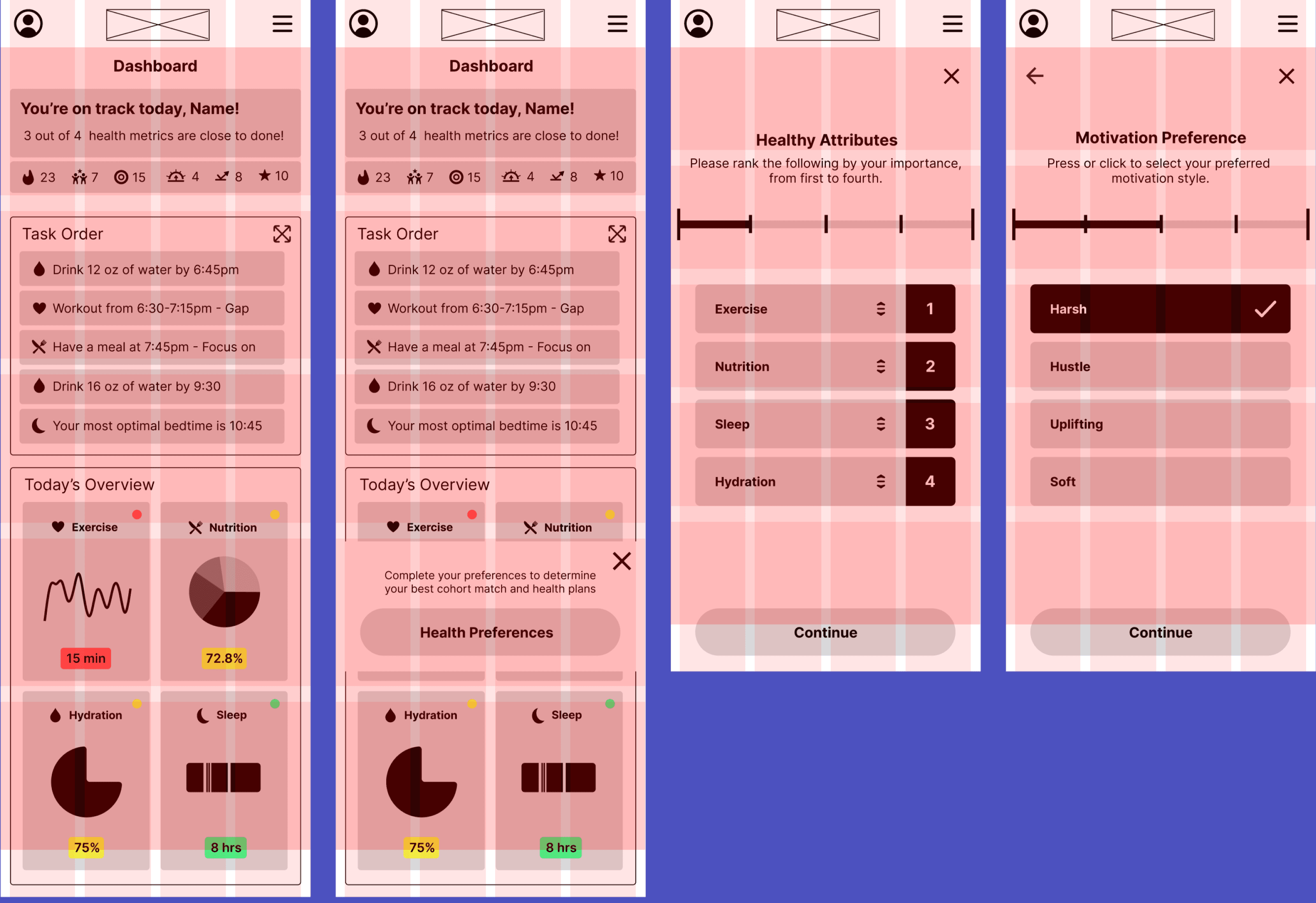
With these mid-fidelity designs, we are moving closer towards the visual feeling and branding. I wanted to foster a happy and fun environment with engaging and vibrant UI. Smooth corners, simple graphics, and rounded font.
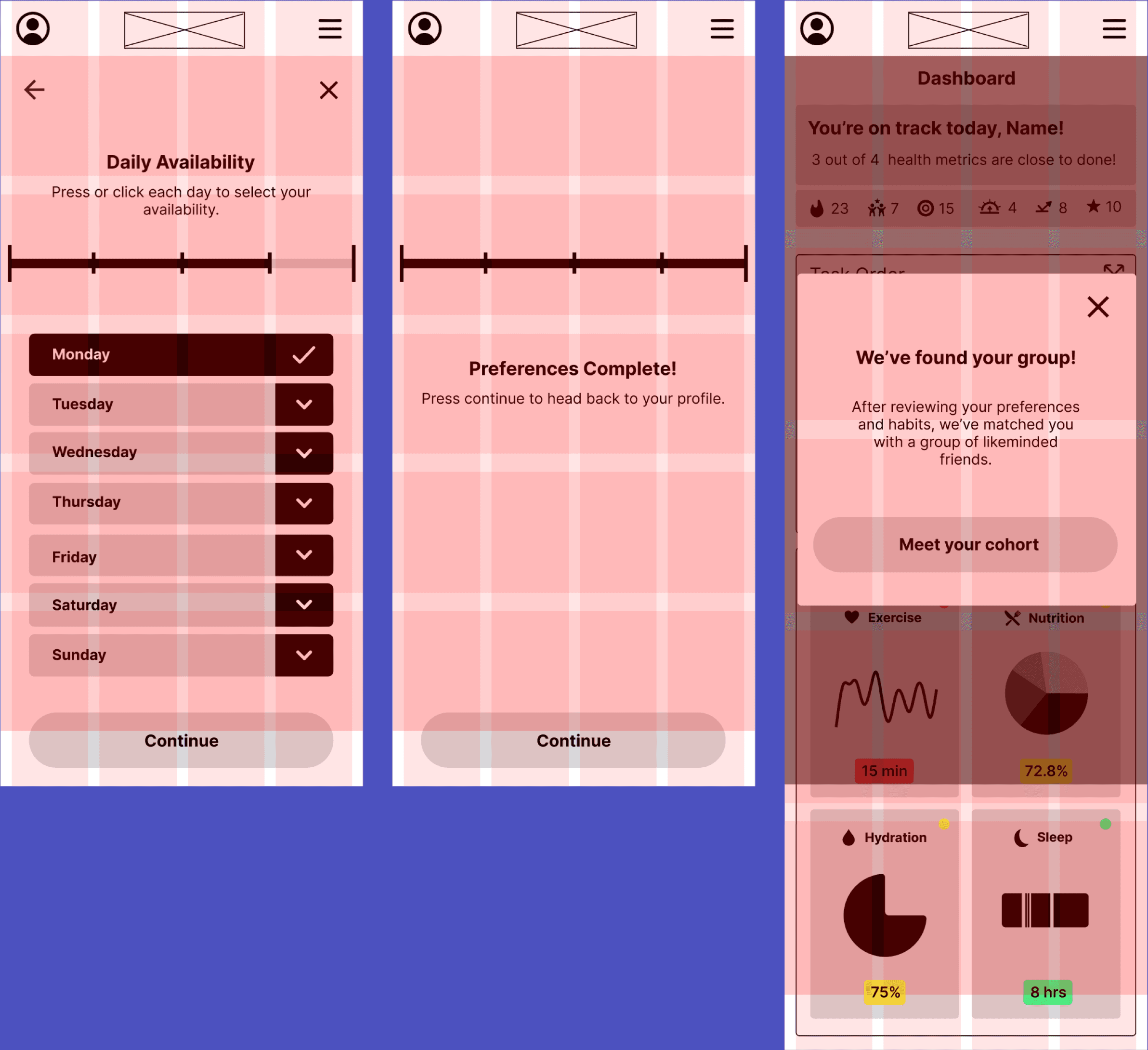
High-Fidelity Wireframes - Refining and adjusting
Advancements from low/mid-fi included:
Improved visual hierarchy
Selected vibrant, motivating color scheme
Chose approachable, readable fonts
Replaced bland screens with iterative enhancements for a livelier experience
Testing & Next Steps
Usability Testing - What causes friction
Objectives
At the late prototype stage, I focused on:
Evaluating usefulness of onboarding questions
Finding pain points in crucial flows (cohort joining, habit tracking)
Checking if users understood their location/context within the app
Methods
Mouse and hand tracking to measure interaction paths
Facial expression tracking for emotional response
Time-to-complete analysis
Joint review interviews (asking users to explain actions and reasoning)
Results
Positives
100% of users successfully completed both core flows
Users praised the vibrant color scheme and visual friendliness
Negatives
Overlay and layering issues caused confusion
5 out of 6 users mentioned difficulty using the availability selection screen
Prototype Adjustments- Applying usability findings
Iterations
Availability Time Selection: Redesigned for clarity and speed
Visual Design of Cohorts Screen: Enhanced organization and added visual anchors
Wording & Hierarchy: Improved microcopy and adjusted emphasis for key actions
Overflow & Layering Fixes: Resolved visual glitches that distracted from flow
Before

After

Reflection and Next Steps - What was learned and where to go
Reflection
Designing Able emphasized the importance of user empathy and realistic expectations for engagement:
Even users motivated to improve their health need gentle structure, encouragement, and simplicity — not overwhelming features.
Testing revealed that early wins (like completing onboarding quickly) build momentum, and visual delight matters more than I initially predicted.
Next Steps
New Features: Add features like mini-challenges, weekly goals, or community badges to sustain engagement.
Interactivity: Increase interactivity for more naturalistic testing, especially around cohort communications and habit customization.
Additional User Testing: Run another round of usability studies on new features and upgraded flows to validate effectiveness.
